UX Case Study: Enhancing Content Discovery in Instagram
Redefining content discovery on Instagram through smart UI, local relevance, and meaningful personalization.
Role
UX/UI Designer
Platform
Mobile app
Duration
1 week
As a junior designer exploring the intersection of product design and user empathy, I challenged myself to rethink one of the most familiar digital spaces — Instagram.
It was a passion project inspired by everyday friction and a wish to make discovery feel human again.
Instead of reinventing the wheel, I explored subtle UI and UX enhancements — small shifts that could make a big impact on how users connect with content they care about.
Challenges
This case study explores subtle yet powerful improvements to Instagram’s user experience by addressing real, recurring pain points:
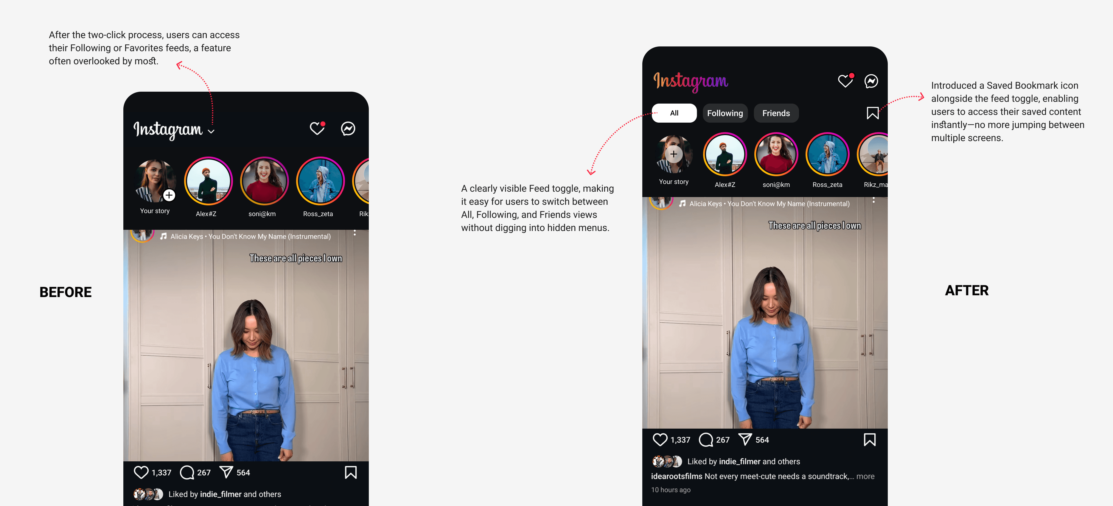
Disconnection from close circles
Users felt overwhelmed by algorithmic noise, with no simple way to see content from close friends or people they actually followed.
Lost in the “Saved” black hole
While saving posts was frequent, returning to them wasn’t. The journey to find them again felt unintuitive and buried.
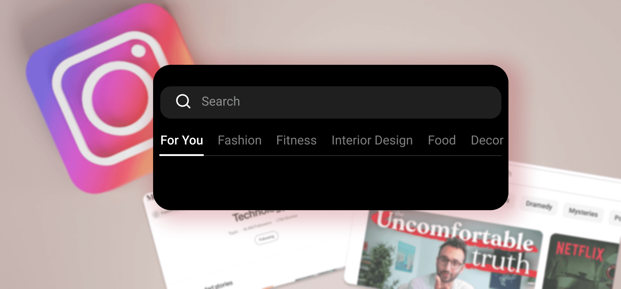
A Missed opportunity - Search journey
Search and Explore lacked context. Users couldn’t filter or mute topics, and location-based discovery wasn’t easily accessible — making the experience feel random, not curated.
Solutions
Feed Toggle for Personalized Control
Introduced a clear, three-tab toggle — All, Following, and Friends — at the top of the feed to give users instant control over what they see, without disrupting the existing UI structure.
Horizontal Tag Filter for Effortless Browsing
Placed a scrollable, context-aware filter (e.g., Fashion, Travel, Fitness) beneath the search bar to help users dive into themes of interest without typing.
Nearby Explore Mode
Added a "📍 Explore Nearby" toggle to surface locally trending content using geotags and regional hashtags — boosting real-time, place-based discovery.
Discoverability
Implemented a three-tab toggle positioned at the top of the feed to enhance content discovery and improve user navigation:
All (default, algorithmic feed)
Following (content from people you follow)
Friends or Favorites (close connections)
Key UX Decision: Make Saved Content Instantly Accessible
I added a persistent Saved Posts icon beside key actions like DMs and notifications, letting users jump back into saved inspiration without the cognitive burden of searching.
These micro-interactions reduce friction, flatten navigation, and empower users to personalize their feed without changing behavior — just better defaults, where they matter most.
Horizontal Tags: Effortless Content Browsing
To reduce content fatigue and enable faster discovery, I added a horizontal tag filter directly under the search bar — allowing users to browse by theme with a single tap.
Popular categories like Fashion, Travel, Fitness, and Weddings act as lightweight entry points for curated exploration — no search terms, no scrolling overwhelm.
Key UX Decision: Leverage Familiar Patterns for Speed
Inspired by YouTube and Medium, this scrollable tag bar offers instant context without changing the core layout — users instinctively know how to interact.
By reducing ambiguity and giving structure to discovery, this small addition drives faster content access, clearer intent-matching, and a more personalized Explore experience — all without adding user effort.
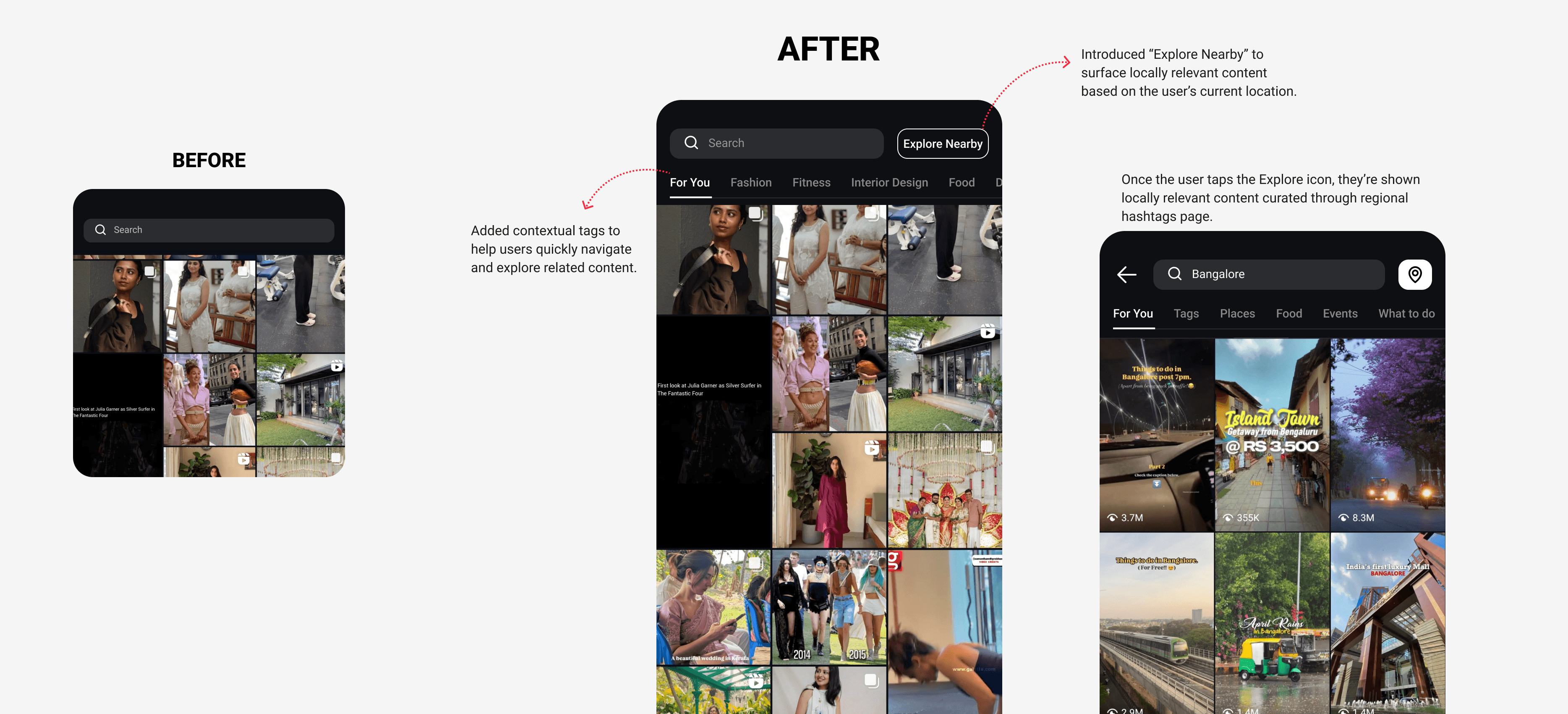
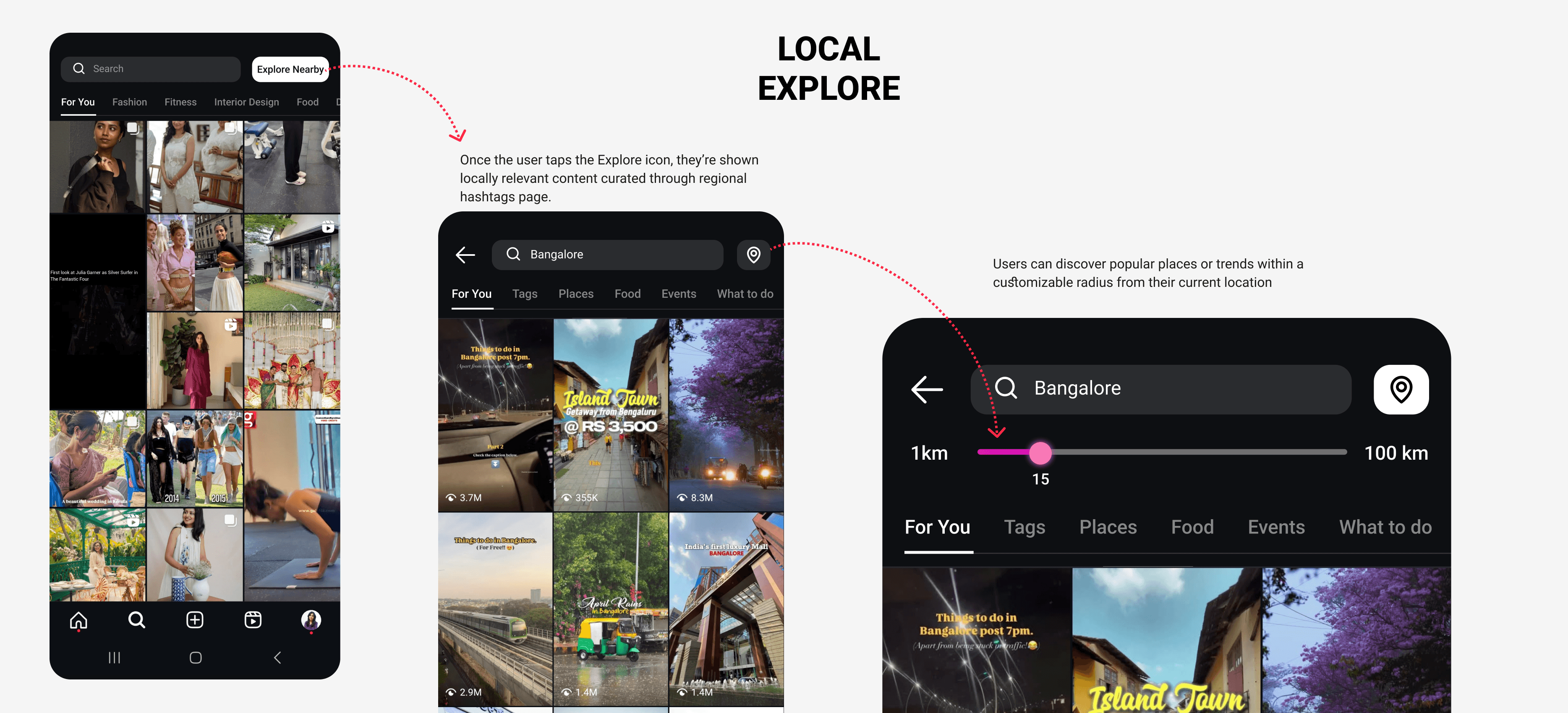
Explore Nearby: Making Discovery Feel Personal & Local
To bridge the gap between digital browsing and real-world relevance, I introduced an “Explore Nearby” toggle—seamlessly integrated within the search or tag filter section.
When enabled, it transforms the Explore feed to highlight locally trending content—pulling in posts from nearby geotags, regional hashtags, and popular reels within a user’s city or custom radius.
Key UX Decision: Proximity-Based Personalization
By surfacing content that’s happening around you, the feed becomes instantly more relatable—whether it’s a café 5 minutes away or an indie event this weekend.
This feature not only fuels real-time engagement and spontaneity but also supports local creators, businesses, and communities—turning passive browsing into opportunities to connect offline.
Impact
Even without formal analytics, early peer feedback showed that simple, visible changes—like local toggles and mood-based tags—made the experience feel more personal and less overwhelming, empowering users to navigate with purpose.
Other projects
Smash App UX Overhaul: Powering the Future of Local Badminton
A seamless, all-in-one platform that transforms how players book courts, find partners, manage coaching, and host matches — designed to boost engagement and drive growth with every tap.
Speed Turtle: A Gentle Habit Tracker for Sustainable Progress
Redesigning the visual experience to make habit tracking supportive, warm, and non-intimidating.